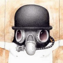
Here are the Faust posters a little more developed. I'm at the point of deciding which direction for a final. I like the first one. I tried the textured background with the others but it didn't quite work. I keep going back and forth with tail/pen thing. Seems kind of hokey but then I think it seems OK. Maybe because I never thought it was great I should just take it out.
A comment reminded me of an early sketch where the tail became a necktie. I think I like it. Thanks Bjorn.


7 comments:
looking better and better Bill! I dig it!
I'm leaning towards the third one. The white space surrounding the second and the third one really make the figure stand out.
What you did with the tail and the horns on the second version is really strong. So strong the illustration actually isn't needed. The title and the play with the tail and the horn on the 's' say it all.
That's why I would go for the third one.Still, you could explore the tail-thing on the 's' more. I like that. This gives you a perfect oppertunity to 'tie' the title and the illo as one.
How about getting rid of the horns on the 's' and put them back on the figure again and let the tail on the 's' curl around his neck. Not tight, relaxed just resting on his shoulder.
Man I hope to do a poster like this one time. I'm in love with Polish poster designers. They master the art of cultural posterdesign like nobody else I think.
Curs BNR
I found your blog casually, and I made a great discovery
great works!.. and i especially love this cover..!
3rd one
I like them all :)
I like the picture with the horns and tail on the title. I feel the male figure in the pictures is Doctor Faust and not Mephistopheles so shouldn't have horns and a tail. I think they work quite well on the title though. As usual wonderful work!
Post a Comment