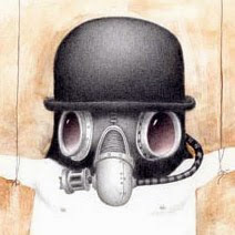
After all that here is the final version of "Lesser of Three" with several process shots. I'm still debating whether to go with the blue bubble window or clear. What do you think?
I like how there are three blue circles creating a downward diagonal from the top left and three white faces creating a diagonal from the bottom left. When it's clear the face of the girl draws too much attention it becomes very focal. With it blue you have to look for her a bit. Blue is also a bit more mysterious, confined and creepy. What effect did you want?
Thanks for all your comments. The dilemma is blue: two nice diagonal taking the emphasis off of the woman or clear: putting the emphasis on her. I think I've finally decided to go blue and create a flow rather than a stopping point. Sorry Sean.
Great work! Looks amazing! I like both but it all depends on what you are going for.
The clear is def. a stopping point in the picture. It also says, she was recently placed in there and it doesn't appear to be cold as her flesh tones are still present. To me the Blue seems that she's been in there a long time, it's cold and death is near.
Both tell a different point in the story. Great stuff though really!


13 comments:
Definitely blue.
This is a truly wonderful piece.
I vote for the blue bubble window too.
I like it blue
Howdy,
The detail in 'Lesser of Three' is incredible.
Love your work - you've inspired me!
Peace,
LuLu
clear
blue bubble
Blue bubble window is definitely more creepy.
Blue.
I like how there are three blue circles creating a downward diagonal from the top left and three white faces creating a diagonal from the bottom left. When it's clear the face of the girl draws too much attention it becomes very focal. With it blue you have to look for her a bit. Blue is also a bit more mysterious, confined and creepy. What effect did you want?
I like blue too :)
Blue.
Blue, btw, beautiful painting!
Thanks for all your comments. The dilemma is blue: two nice diagonal taking the emphasis off of the woman or clear: putting the emphasis on her. I think I've finally decided to go blue and create a flow rather than a stopping point. Sorry Sean.
Great work! Looks amazing! I like both but it all depends on what you are going for.
The clear is def. a stopping point in the picture. It also says, she was recently placed in there and it doesn't appear to be cold as her flesh tones are still present.
To me the Blue seems that she's been in there a long time, it's cold and death is near.
Both tell a different point in the story.
Great stuff though really!
Post a Comment